
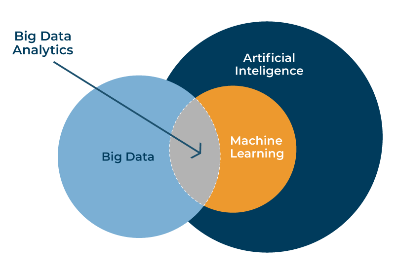
How AI enhances data visualization in big data analysis is revolutionizing how we understand complex datasets. No longer are we limited by the human capacity to sift through terabytes of information; AI algorithms are unlocking hidden patterns, automating insightful visualizations, and transforming raw data into compelling narratives. This exploration delves into the ways AI is not just improving, but fundamentally reshaping, the landscape of data analysis.
From automated visualization generation tailored to specific audiences to interactive dashboards that respond dynamically to user queries, AI is empowering analysts to uncover previously invisible trends and communicate complex findings with unprecedented clarity and efficiency. This enhanced capability allows for more effective decision-making across diverse sectors, from finance and healthcare to marketing and scientific research.
AI-Driven Data Exploration and Pattern Identification
AI significantly enhances data visualization in big data analysis by automating the discovery of complex patterns and relationships hidden within massive datasets. Traditional methods often struggle with the sheer volume and dimensionality of big data, limiting the insights human analysts can glean. AI algorithms, particularly machine learning, offer a powerful solution, enabling the identification of subtle correlations and anomalies that would otherwise remain undetected.
Machine learning algorithms excel at identifying complex patterns and relationships within large datasets that are difficult or impossible for humans to detect manually. These algorithms can sift through terabytes of data, identifying non-linear correlations and intricate dependencies that escape human observation. For example, a machine learning model might uncover a previously unknown relationship between seemingly disparate variables, such as customer demographics and product preferences, revealing valuable insights for targeted marketing campaigns.
This capability is particularly crucial in domains like fraud detection, predictive maintenance, and personalized medicine, where identifying subtle patterns can have significant implications.
Anomaly Detection and Outlier Analysis Techniques
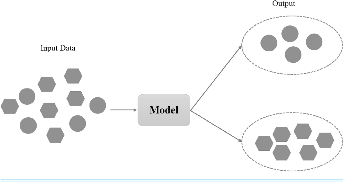
AI employs several techniques for anomaly detection and outlier analysis within data visualizations. These techniques enhance the visual representation of data by highlighting unusual data points or patterns, thereby drawing attention to potential problems or opportunities. One common approach involves using clustering algorithms, such as k-means or DBSCAN, to group similar data points. Data points that fall outside of these clusters are flagged as potential anomalies.
Another technique utilizes machine learning models, such as one-class SVMs or isolation forests, which are specifically trained to identify outliers based on the characteristics of the majority of the data. These models can effectively detect anomalies even in high-dimensional data where traditional methods struggle. Furthermore, techniques like autoencoders can be used to reconstruct the data, with anomalies identified by their high reconstruction errors.
Comparative Analysis of Traditional and AI-Enhanced Data Visualization, How AI enhances data visualization in big data analysis
Traditional data visualization methods, such as bar charts, scatter plots, and histograms, are effective for exploring smaller datasets and identifying simple patterns. However, their effectiveness diminishes drastically when dealing with high-dimensional or extremely large datasets. AI-enhanced visualization methods significantly improve efficiency and accuracy by automating the process of pattern identification and anomaly detection. AI can process and analyze vast amounts of data much faster than humans, providing insights in a fraction of the time.
Moreover, AI algorithms can identify subtle patterns and relationships that are often missed by human analysts, leading to a more accurate and comprehensive understanding of the data. For example, while a human analyst might struggle to interpret a scatter plot with millions of data points, an AI algorithm can identify clusters and outliers within the data, generating a more insightful visualization that highlights key patterns.
AI Unveiling Hidden Insights: A Hypothetical Scenario
Imagine a telecommunications company with a massive dataset containing millions of customer records, including call logs, data usage, and customer service interactions. Traditional data visualization techniques would struggle to reveal meaningful insights from this dataset. However, an AI-powered interactive data visualization tool could be employed. The AI could automatically identify clusters of customers with similar usage patterns and churn probabilities.
The visualization could then dynamically display these clusters on a map, highlighting geographical regions with high churn rates. Further, by integrating natural language processing, the AI could analyze customer service interactions to identify the root causes of churn within specific clusters. This interactive visualization would allow analysts to drill down into specific clusters, explore individual customer profiles, and gain a deeper understanding of the factors driving customer churn.
This detailed understanding would empower the company to develop targeted retention strategies and improve customer satisfaction.
Automated Data Visualization Generation
AI is revolutionizing data visualization in big data analysis by automating the selection of appropriate visualization types and generating multiple visualization options. This automation significantly reduces the time and expertise required for effective data representation, allowing analysts to focus on insights rather than chart creation. The process leverages machine learning algorithms to analyze data characteristics, identify patterns, and recommend the most suitable visualization methods.AI’s ability to automatically select visualization types considers various factors.
These include the data type (categorical, numerical, temporal), the number of data points, the relationships between variables, and the desired communication objective. For example, a scatter plot might be suggested for exploring the correlation between two numerical variables, while a bar chart would be more appropriate for comparing categorical data. The algorithm also considers the intended audience, adjusting the complexity and style of the visualization accordingly.
A simpler chart might be generated for a less technical audience, while a more sophisticated one would be created for data scientists.
AI’s Role in Visualization Type Selection
AI algorithms analyze the data’s structure and characteristics to determine the optimal visualization type. This process involves feature extraction, where relevant attributes of the data are identified, and model selection, where the algorithm chooses the visualization method best suited to represent those features. For instance, if the data exhibits a clear temporal trend, the algorithm might select a line chart or area chart.
If the data is hierarchical, a treemap or sunburst chart could be chosen. The algorithm’s decision-making process is often based on a combination of statistical measures and predefined rules, ensuring both accuracy and efficiency.
Generating Multiple Visualization Options
Instead of presenting a single visualization, AI-powered tools can generate multiple options, each representing the data in a different way. This allows users to compare and contrast various representations, selecting the visualization that best conveys the insights they wish to highlight. For example, the same dataset could be represented as a scatter plot, a heatmap, and a box plot, each providing a different perspective on the data’s distribution and relationships.
This comparative approach enhances the understanding and interpretation of the data, reducing the risk of misinterpretations due to a single, potentially biased, visualization.
Comparison of AI-Powered Data Visualization Tools
| Tool | Features | Strengths | Weaknesses |
|---|---|---|---|
| Tableau Prep Builder with AI | Automated data cleaning, preparation, and visualization suggestions. | Streamlines data preparation and visualization workflow. Good for non-technical users. | Limited customization options compared to fully manual approaches. |
| Dataiku DSS | Automated visualization recommendations, interactive dashboards, collaborative data science platform. | Strong collaborative features. Handles large datasets efficiently. | Can be expensive and requires a steeper learning curve than simpler tools. |
| Power BI with AI features | Automated insights, quick insights, and data storytelling capabilities. | User-friendly interface, integrates well with other Microsoft products. | AI features might not be as advanced as dedicated AI-powered visualization tools. |
| Google Cloud AI Platform (with custom models) | Highly customizable; allows development of bespoke visualization solutions tailored to specific data and business needs. | Extremely flexible and powerful. Can handle very complex data analysis and visualization tasks. | Requires significant technical expertise to develop and implement. |
Advantages and Disadvantages of AI-Automated Data Visualization
Automating data visualization offers significant advantages, including increased speed and efficiency, reduced human error, and the ability to handle large datasets that would be impractical to analyze manually. However, it also has limitations. AI-generated visualizations may not always capture the nuances of the data or effectively communicate complex relationships in the way a skilled human analyst might.
Furthermore, over-reliance on AI could lead to a lack of critical thinking and a reduced understanding of the underlying data. The ideal approach often involves a combination of AI-assisted automation and human expertise, leveraging the strengths of both.
Interactive and Dynamic Visualizations
AI significantly elevates data visualization beyond static images, enabling the creation of interactive dashboards and visualizations that adapt dynamically to user input and exploration. This interactivity fosters deeper insights and more effective communication of complex data patterns. The ability to manipulate and explore data visually empowers users to uncover hidden trends and make more informed decisions.AI facilitates the creation of interactive dashboards and visualizations that respond dynamically to user input and exploration through sophisticated algorithms and machine learning models.
These algorithms analyze user interactions and adapt the visualization accordingly, providing a personalized and efficient analytical experience. For instance, a user might filter data by specific criteria, and the visualization will instantly update to reflect the filtered subset. This dynamic response is a key differentiator from traditional static visualizations.
AI-Powered Interactive Features
The integration of AI unlocks a range of powerful interactive features within data visualization tools. These features enhance user interaction, allowing for a more intuitive and insightful exploration of data.
- Drill-down capabilities: AI can intelligently suggest drill-down paths based on user interactions and data patterns, guiding users to areas of particular interest. For example, if a user selects a specific region on a geographical map, AI could automatically drill down to show detailed data for that region’s sub-divisions.
- Filtering and Selection: AI can automate the filtering process by suggesting relevant filters based on the data and the user’s previous actions. Instead of manually selecting filters, users can utilize AI-powered suggestions to quickly narrow down the data to focus on specific aspects. Imagine an e-commerce dashboard where AI automatically filters sales data to highlight products with the highest conversion rates.
- Zooming and Panning: AI can optimize zooming and panning behavior based on the data density and user focus. This ensures that users can easily navigate complex visualizations without losing crucial details. In a visualization of social media activity, AI could automatically adjust the zoom level to focus on areas with high interaction, while preventing excessive detail in areas with low activity.
AI-Driven Personalization of Visualizations
AI can personalize data visualizations by adapting to individual user preferences and analytical needs. This personalized experience ensures that the visualization is tailored to the user’s specific requirements, improving both efficiency and understanding.AI algorithms can learn user preferences over time, adapting the visualization’s layout, color schemes, and even the types of charts used based on past interactions. For example, a user who frequently focuses on specific metrics might see those metrics prominently displayed in future visualizations.
Similarly, a user who prefers certain chart types will see those types prioritized in the visualization options. This level of personalization significantly improves the user experience and makes data analysis more accessible.
Potential Interactive Features in AI-Powered Data Visualization Tools
Several advanced interactive features can be incorporated into AI-powered data visualization tools to further enhance the user experience and analytical capabilities.
- Natural Language Processing (NLP) Integration: Users could interact with the visualization using natural language queries, allowing for intuitive data exploration and analysis. For instance, a user could ask “Show me sales trends for the last quarter” and the visualization would automatically update to display the relevant data.
- Predictive Analytics Integration: AI could overlay predictive models onto the visualization, allowing users to see potential future trends and scenarios. This could be particularly useful in forecasting sales, predicting customer behavior, or assessing risk.
- Automated Report Generation: AI could automatically generate reports based on user interactions and selected data, saving time and effort. These reports could be customized based on user preferences and analytical needs.
- Anomaly Detection Highlighting: AI could automatically highlight anomalies or outliers in the data, drawing the user’s attention to potentially important events or patterns that might otherwise be missed.
Enhanced Data Storytelling and Communication: How AI Enhances Data Visualization In Big Data Analysis

AI significantly enhances the ability to transform raw data into compelling narratives, moving beyond simple data presentation to insightful storytelling that resonates with diverse audiences. This is achieved through automated analysis, intelligent summarization, and the generation of visualizations tailored for optimal communication.AI facilitates the creation of compelling narratives from data by automating the generation of insightful summaries and annotations directly within visualizations.
This goes beyond simply displaying charts and graphs; AI can identify key trends, outliers, and correlations, automatically adding context and explanations to make the data’s story clear and easy to understand. This automation frees data analysts to focus on higher-level interpretation and strategic communication, rather than spending time on manual annotation and report writing.
AI-Driven Improvements to Data Visualization Clarity and Effectiveness
AI improves data visualization clarity and effectiveness by adapting the visualization style and complexity to the audience. For technical audiences, AI can generate visualizations with a higher level of detail and complexity, including advanced statistical measures and interactive elements. For non-technical audiences, AI can simplify visualizations, using clear and concise labels, intuitive color schemes, and easily digestible formats such as interactive dashboards or simplified infographics.
This ensures that the core message is effectively communicated regardless of the audience’s technical expertise.
Case Study: AI-Powered Data Visualization in Healthcare
A major healthcare provider used AI-powered data visualization to communicate complex patient outcome data to its board of directors. The AI system analyzed millions of patient records, identifying key trends in treatment effectiveness and cost variations across different hospitals within the system. Instead of presenting lengthy reports filled with statistical tables, the AI generated an interactive dashboard that visually displayed these trends, highlighting areas for improvement and cost savings.
The dashboard used clear, non-technical language and easily digestible charts, enabling the board to quickly grasp the key findings and make informed decisions based on data-driven insights. This resulted in a significant improvement in strategic planning and resource allocation within the healthcare system.
Visual Representation of AI-Enhanced Data Storytelling
Imagine a bar chart depicting sales figures across different regions. A traditional chart simply displays the bars representing sales. An AI-enhanced version would automatically highlight the highest-performing region with a distinct color and annotation stating “Top Performing Region: +25% Growth,” clearly emphasizing the key takeaway. Furthermore, subtle color gradients could represent the growth rate within each region, adding another layer of contextual information without overwhelming the viewer.
This visualization would then be accompanied by a concise, AI-generated summary highlighting the key trends and insights, further reinforcing the narrative and minimizing the need for extensive written explanations. The overall effect is a visualization that is both visually appealing and highly informative, resulting in a significantly greater impact and clarity.
Addressing Challenges and Limitations
The transformative potential of AI in data visualization for big data analysis is undeniable. However, realizing this potential requires careful consideration of inherent challenges and limitations. These range from technical hurdles to ethical concerns, all of which demand proactive mitigation strategies. Ignoring these aspects risks inaccurate insights, biased representations, and ultimately, flawed decision-making.Data bias, interpretability issues, and substantial computational costs represent significant hurdles in the widespread adoption of AI-driven data visualization.
Ethical considerations, including transparency and accountability, are equally crucial and must be addressed to ensure responsible innovation.
Data Bias and Interpretability
AI algorithms are trained on data, and if this data reflects existing societal biases, the resulting visualizations will likely perpetuate and even amplify those biases. For example, an AI system trained on historical hiring data might inadvertently create visualizations that reinforce gender or racial disparities in employment. Furthermore, the “black box” nature of some AI models can make it difficult to understand how the visualization was generated, hindering trust and hindering the ability to identify and correct errors or biases.
Addressing this requires careful data curation, employing techniques like fairness-aware algorithms, and developing methods for explaining the AI’s decision-making process, such as using explainable AI (XAI) techniques.
Computational Costs and Scalability
Processing and visualizing massive datasets requires significant computational resources. The complexity of AI algorithms, especially deep learning models, can lead to high computational costs, potentially limiting accessibility for organizations with limited resources. Scaling AI-driven data visualization to handle ever-growing datasets also poses a significant challenge. Solutions involve optimizing algorithms for efficiency, leveraging cloud computing resources, and exploring techniques like distributed computing to parallelize the processing.
For instance, Google’s use of its cloud infrastructure to power its data visualization tools demonstrates the potential of this approach.
Ethical Considerations: Transparency and Accountability
The ethical implications of using AI in data visualization are profound. Lack of transparency in how visualizations are generated can lead to mistrust and misinterpretations. Similarly, a lack of accountability for the outputs of AI systems can result in the propagation of inaccurate or misleading information. Establishing clear guidelines for responsible AI development and deployment, including mechanisms for auditing and verification, is crucial.
This might involve developing standardized reporting methods that clearly articulate the limitations and potential biases of AI-generated visualizations. Furthermore, fostering a culture of transparency and open communication around the use of AI in data visualization is paramount.
Mitigating Risks and Limitations
Several approaches can effectively mitigate the risks and limitations associated with AI-powered data visualization. These include rigorous data preprocessing to identify and address biases, the use of explainable AI (XAI) techniques to enhance interpretability, and the implementation of robust validation and verification processes to ensure accuracy. Investing in high-performance computing infrastructure and exploring alternative visualization techniques optimized for efficiency can address scalability and computational cost concerns.
Finally, establishing ethical guidelines and regulatory frameworks for the responsible development and deployment of AI-driven data visualization tools is essential.
Future Directions and Advancements
Future advancements in AI-driven data visualization will likely focus on enhancing the interpretability of AI models, improving the efficiency of algorithms, and developing more sophisticated techniques for handling complex data types. We can expect to see wider adoption of XAI methods to provide insights into the decision-making process of AI systems. Furthermore, advancements in interactive and immersive visualization techniques, such as virtual and augmented reality, will offer new ways to explore and interact with complex data.
The integration of AI with other emerging technologies, like quantum computing, could unlock further potential for handling unprecedented data volumes and complexities. The development of more robust and standardized evaluation metrics for AI-driven data visualization is also a crucial area for future research.
Conclusive Thoughts

In conclusion, the integration of AI into data visualization is not merely an incremental improvement; it represents a paradigm shift in how we approach big data analysis. By automating complex tasks, uncovering hidden insights, and enhancing communication, AI empowers analysts to extract greater value from their data than ever before. As AI technologies continue to evolve, we can anticipate even more sophisticated and impactful applications, further blurring the lines between data and actionable intelligence.